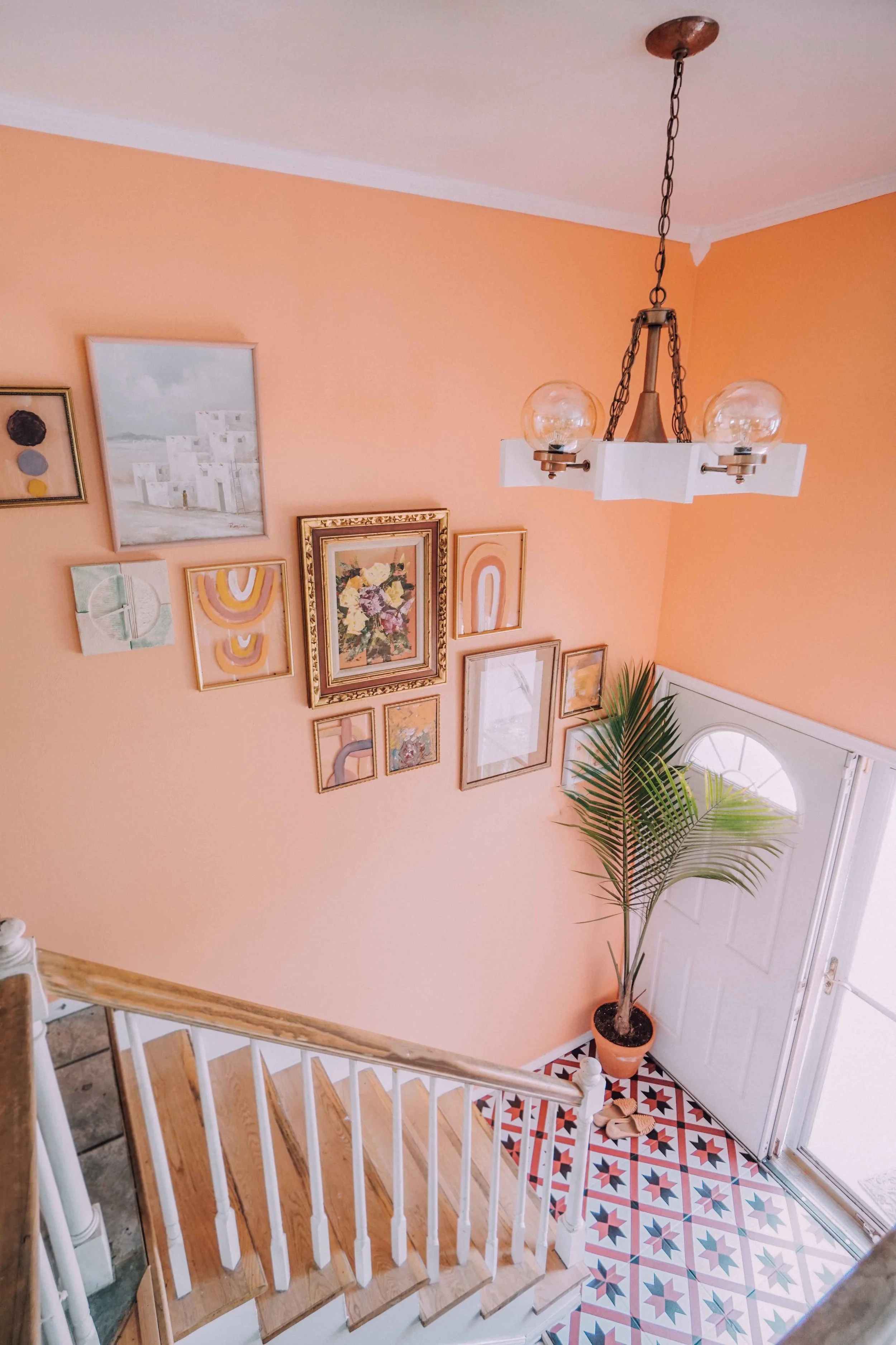
Entry way Refresh
When you first get a new home, there are a million projects that need to be done and prioritizing is a must! I hate dabbling in 56473857 different projects and I really like to focus on one area at a time and just knock it out! We've been slowly but steadily moving through our upstairs, one room at a time (all leading up to our big kitchen reno that we're starting soon!) and the last space before the kitchen, was our entryway!
We live in a split level, which is not ideal but nothing some paint, art, and tile stickers cant fix! For real though, whoever invented split levels is the actual worst! Walking into a home and seeing stairs first thing doesn't seem very inviting, so I knew I wanted this little space to be bold, but warm and colorful and something that made you want to walk up those stairs!
Here is a quick before shot of this space!
I never ever remember to take before photos, so a shot of the entry way, right as Nate is starting to paint it, is as good as it's gonna get, but I think you get the picture!
The walls were a dark beige and I definitely was not a fan of the light fixture! I'm sure I could have done something to make this space a bit better before we started working on it, but I'm a go big or go home kind of girl!
The tiles on the landing were white. I love me some white tile, but this tile is about 20 years old, scratched, chipped, cracked and stained! We knew it needed to go, but again, kitchen reno is right around the corner and we honestly didn't have the time or money to tile down here! Enter BleUcoin! They are on Etsy and make the most amazing tile and wall stickers/ decals in the most amazing prints and it was the perfect solution! I chose the Chester print and you can find it here!
We had tested out paint samples weeks before and were so excited about to use oxide by Behr! We were wanting an orangey- terra cotta color and we loved the sample we painted! This was a tough paint job! We have crown and high ceilings and had to build a little scaffold! It took us an entire day to paint this entry way and hallway! We finally finished, headed off to bed around 12 a.m, woke up the next morning, and absolutely hated it!
It was way too dark for this windowless entryway and the color just didn't mesh well with the rest of our home! Walking in the door, it was dark and uninviting and totally not what we had envisioned! I honestly still love this color so much (and we ended up using this paint for a different project) but it just didn't work and we were so bummed about how much time we just spent painting and how we still hated our entryway! Sometimes things don't always go right the first time, so we immediately tried more samples and got back to masking and I'm soooooo glad we did!
For our new color, we ended up going with Carotene by Behr and I honestly couldn't be more in love!!!
We pushed this project off for so long and kept saying "oh, it's just the entryway" but I cant even explain how much impact this has had on the rest of the house!
The light fixture is mid-century vintage! My parents just recently bought a home that was a little dated and this light fixture was in their dining room! My mama hated it, but I fell in loveeeee! It was wood and brass and I painted the wood white and the metal copper and here she is in all her glory!
I also knew I wanted art, because duhhhh! I typically go for all vintage art, but I wanted to try something different and work with some vintage art as well as some newer more modern/ contemporary art! But again, kitchen reno, so I had to make it cheap! I thrifted a bunch of gold frames for $.99, took the backs out, and had a bit of fun painting on them!
My girl, Charliee, woke up from her nap while I was painting and insisted on painting too. She did the one on the bottom right and it's definitely my favorite. Abstract genius!
Moral of the story is, paint is magic, tile stickers are even more magic, my baby paints better than I do, and I couldn't be more happy to walk into my home!


